Sydney Soiree
Native Mobile App • Branding • Wireframes • Flowcharts • Product Design • End- to- end User Experience/ User Interface • Prototyping
Application Concept
Sydney Soiree: Elevating Social Connections Through Innovative Design
Sydney Soiree is an events business that caters to the 20-35-year-old singles demographic in the Eastern Suburbs of Sydney. The company organizes a roaming dinner party where participants meet at a final location where groups from different dinner parties come together.
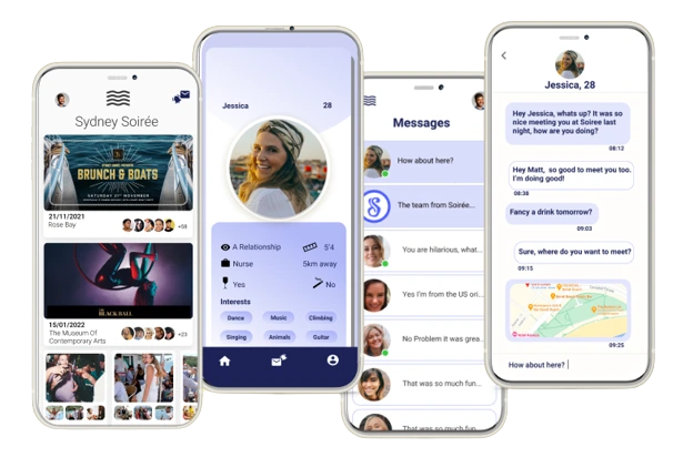
To elevate their business, the founders of Sydney Soiree approached me to create a mobile application designed to enhance attendee connectivity and streamline event promotions. This app not only provided a robust platform for marketing future events but also significantly improved the user experience for participants.
For the business, this provided a platform to market future events to a database of interested attendees to increase conversion rates and build a digital customer base. On the other hand, the app also improved the user experience for attendees as they gained a platform where they could follow up with those who attended the event.

My Contributions:
I was working as the only UX/ UI designer on the project therefore I was responsible for the end-to-end design process. This involved defining the brand by researching the market, creating flows and wireframes, developing final UI designs, and conducting testing.
Research and Analysis
Conducting Qualitative Research:
To kickstart the project, we initiated qualitative interviews with singles. We gave the questionnaire to 20 people from both genders encompassing both those who had attended Sydney Soiree events and those who hadn’t. Our objective was to uncover what was lacking in other dating apps. During these interviews, we delved into various aspects to gather insights.
Comparative Analysis
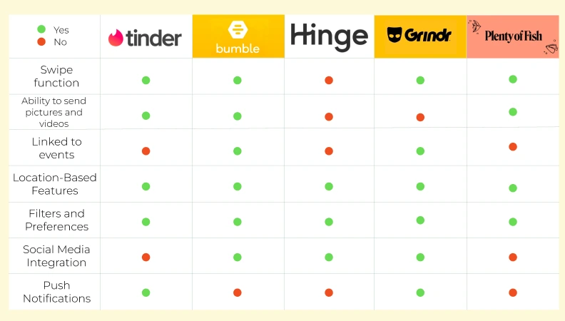
Following the interviews, we proceeded to conduct a comparative analysis of different singles dating platforms.
From information gathered through the qualitative research, we reviewed five of the most popular dating apps. This phase aimed to pinpoint the key areas where existing platforms fell short. We also looked out for key trends that we may adopt for the Sydney Soiree app.
Information Architecture and Navigation
The app was designed with a user-friendly structure to fulfill the client’s primary objectives of enabling customers to easily book upcoming events and facilitating seamless communication between users.
A comprehensive onboarding experience was incorporated to highlight the app’s key benefits, enhance navigation, and ensure a smooth browsing experience.


Wireframing
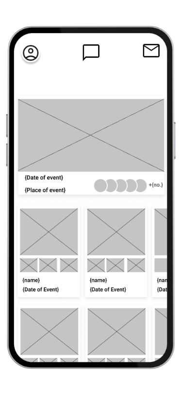
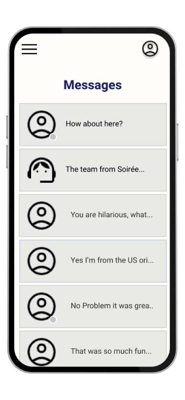
With a clear information architecture in place, we delved into creating wireframes for the app’s interface on a screen-by-screen level. These wireframes served as the blueprint for the apps design.
Landing Page-Our primary focus centered on the landing page. We aimed to immediately address a pivotal aspect of the project- allowing clients to easily book upcoming events
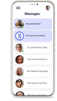
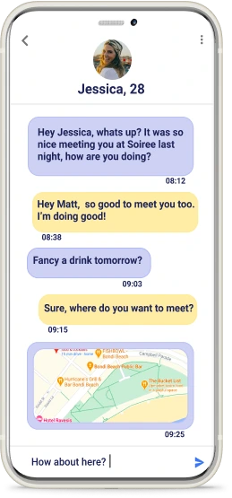
Chat Feature- Another crucial feature we developed was the chat functionality. Within this feature, users can easily connect with the admin, receive event updates, engage with notifications post- event, and receive event advertisement- all designed to enhance user engagement.
Visual Design and Branding
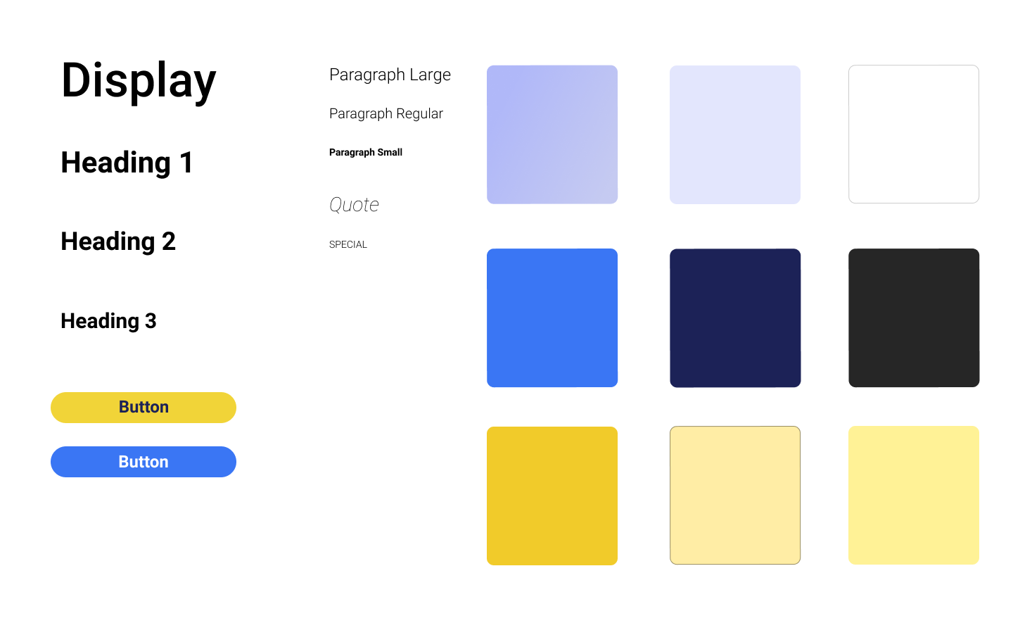
The Sydney Soiree team had a clear vision for their brand- a beachy, coastal theme. This theme aimed to evoke the relaxed, enjoyable atmosphere of Sydney’s famous beaches, mirroring the lifestyle and ambiance of the region. To align with this concept, we drew inspiration from the colours prominently featured on their website, seamlessly integrating them into our design.
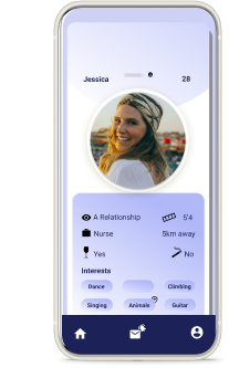
Design Elements: In line with the beachy theme, our design approach incorporated a distinctive hamburger menu with wave- like lines. This design coice served a dual purpose. Firstly, it offered users a visually appealing and intuitive navigation hub. By clicking on the hamburger menu, users could easily access key sections of the website, including the homepage which was also the booking page and the chat feature- two of the key MVP’s. Secondly, the wave lines not only reinforced the coastal aesthetic but also added an element of dynamism to the user interface.

User- friendly Aesthetic
Throughout the design process, we remained committed to maintaining a sense of simplicity and user- friendliness. This approach was delibrate, ensuring that users of all technical backgrounds and familiarity levels could effortlessly navigate the platform. By keeping the overall aesthetic clean and uncluttered, we aimed to create a welcoming and approachable digital space that resonated with Sydney Soiree’s target audience
Results and Impact
In essence, our design for Sydney Soiree blended the desired beachy theme with the practicality of an intuitive user interface, resulting in a visually appealing and user- friendly online dating platform tailored to the unique needs and preferences of singles in Sydney’s Eastern Suburbs.