Sketch • Invision • Whimsical • Mobile Native App • Wireframes • User Research • Flowcharts • End to end UI/ UX Design • Prototyping
Sketch • Invision • Whimsical • Mobile Native App • Wireframes • User Research • Flowcharts • End to end UI/ UX Design • Prototyping
Challenge Statement
Our project aimed to create a digital platform that enables charitable donations to people experiencing homelessness, removing the need for physical cash transactions. The platform not only facilitates donations but also provides a follow-up aspect, allowing users to receive updates on the individuals they supported.
My Contributions
As this has been a personal project, I have been the sole designer on the project. I was responsible for the end-to-end design process including defining the brand and personas, creating flows and wireframes, developing UI designs, and conducting user testing.
User Research
During our research phase, we conducted interviews with 10 regular donors to charities, who shared that homelessness is one of their top three causes of concern. The insights we gathered from these interviews highlighted six key themes:
Donors valued seeing the positive impact their donations had on those experiencing homelessness.
Many donors felt guilty about not being able to give to the homeless when they did not carry cash.
There was a sense of skepticism about whether the money they donated would be used effectively.
Transparency was identified as a critical factor in building trust with donors, particularly regarding where the money is going.
Personalization was also a key factor in building donor trust, with donors expressing a desire to feel connected to the individuals they were helping through their donations.
“It’s a catch twenty two when you want to give to homeless people because you usually don’t have cash but you want to give them something useful”- Luis Paez, based on qualitative questionnaire.
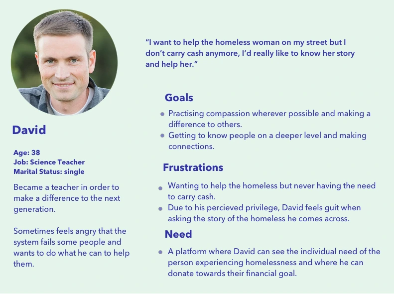
Starting with the basics: Who, what and why?
We started by defining the brand strategy and it’s target audience. We started by defining the brand attributes and created a brand statement. Insights from the user interviews allowed me to form a user persona. Both the brand statement and this persona guided decisions during the entire project.
People donating to homeless charities need a platform that will present to them who and what they will be donating towards. This is in order to give them confidence that they are making a charitable donation to the most impactful cause.
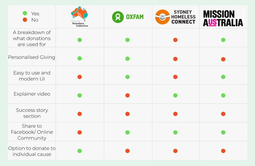
Comparative Analysis
After analyzing four different charities with similar objectives, we discovered that the use of success stories was uncommon, which was also confirmed by our user interviews. While it would be a nice-to-have feature, our primary focus is on solving the problem of charitable donations to the homeless. Thus, we decided to prioritize the core product and consider adding a screen showing participant successes in future sprints.
Furthermore, we noticed that grassroots charities lacked visually appealing user interfaces, while more corporate charities, despite having more advanced interfaces, lacked personalization, which was a key aspect that our user research indicated users desired when donating to charity. As a result, we strived to create a simple yet emotionally engaging UI design with easy navigation in The Connection platform.
Differentiation from the competition
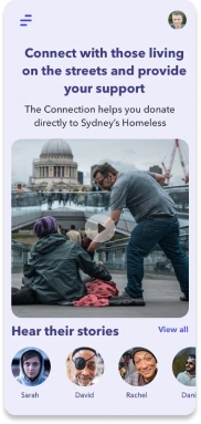
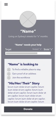
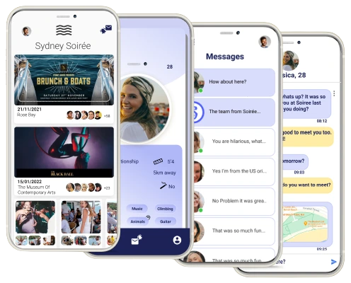
During our research, our team found that charities operating to tackle homelessness shared common features and weaknesses. Larger organisations lacked personalisation but had an appealing UI and good usability, while grassroots charities weren’t as user-friendly but provided explanations on who would receive donations and how funds would be spent. Our sample users noted that they preferred to have this information before donating to a specific charity. To address the challenge of personalising the app, we brainstormed different ways and came up with the idea of issuing a QR code for each person experiencing homelessness who was part of the program. Users could scan the QR code to see what the individual is in need of and their story. This approach would provide users with a direct view of where their donations are going and how they are helping individuals in need. We believe that this feature would enhance the emotional experience of donating and increase user engagement with the platform.
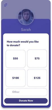
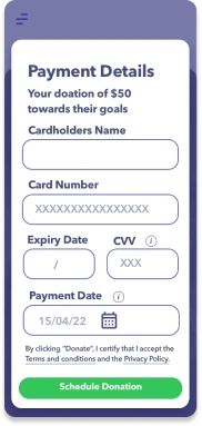
Scan the bar code to see an example of a participant named ‘Sarah’ through InVision.
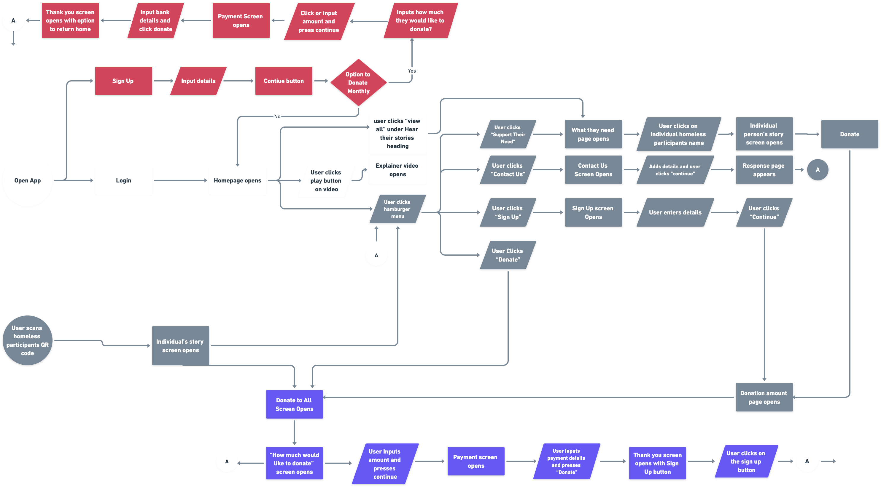
Defining the flow
To visualize the organization of the platform, I created flowchart using Whimsical
Flowcharts are essential in the user experience (UX) design process for mobile apps because they serve as a visual roadmap that helps designers plan and organize the app’s user journey. Mobile app UX is all about creating an intuitive and efficient experience for users, and flowcharts play a pivotal role in achieving this goal. They enable designers to outline the app’s structure, user interactions, and navigation paths, allowing them to identify potential bottlenecks or usability issues before development begins. By visualizing the flow of screens, actions, and transitions, designers can streamline the user’s path, ensure consistency, and anticipate user needs.
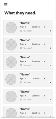
Wireframing
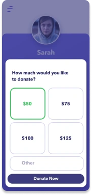
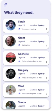
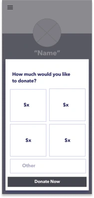
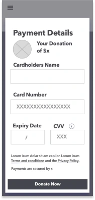
Once we had defined the overall flow of the app, we proceeded with creating wireframes to explore the user experience in more detail on a screen-by-screen level. Our main focus was on the funnel from the initial screen displaying all of the homeless participants to the individual profiles and payment screens. The wireframes allowed us to iterate quickly on different design ideas and get feedback from our team and potential users.
Visual Exploration
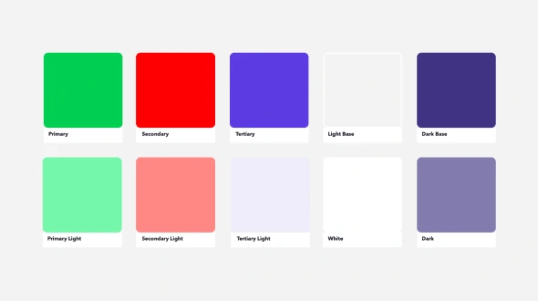
The visual exploration phase of the project focused on creating a user interface (UI) design that aligns with the brand identity and delivers a positive user experience. The goal was to strike a balance between being approachable and impactful without coming across as too formal or serious. This approach aimed to increase conversions and create a positive impact on users who want to help individuals experiencing homelessness. The UI design focused on creating a sense of empathy towards the individuals receiving donations while making it easy for users to navigate the app. The color scheme and typography were selected to evoke a sense of warmth and optimism. The icons and graphics were designed to provide clear and easy-to-understand information to guide users throughout the donation process. Overall, the visual exploration phase aimed to create a user-friendly and visually engaging UI that promotes the core values of the project.
Quality Analysis
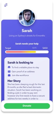
A high fidelity prototype was presented to senior stakeholders to test the usability of the app. A few changes were made to the final design based on the feedback. One of the key changes was the addition of avatar images instead of the profile picture of those people who were experiencing homelessness. This change was made in order to protect their identity and encourage them to use the service without fear of exposure. We therefore changed the QR code scan sheets that the individual would carry to include the picture that is shown on the profile so the donator can identify who they are donating to.
During our further research, we gained a valuable insight that we could utilize avatars as an alternative to participants’ photographs to protect their privacy if they had concerns about it. Here you can see how we have incorporated pictures in replacement of photographs. These pictures would correspond with the images on the handheld signs alongside the barcodes.
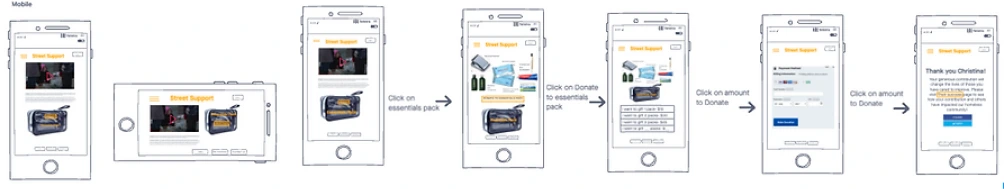
Future Features
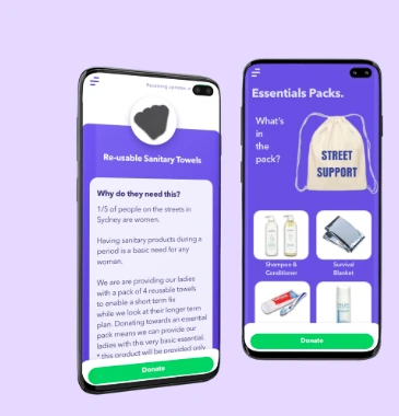
During the research phase, we delved into the idea of introducing “essential packs” as an additional donation avenue. Although we opted not to include this in the Minimum Viable Product (MVP) due to associated costs, we went ahead and crafted a draft using inVision tp provide a visual representation of how this feature could potentially enrich the platform in future iterations.
Summary
Our project successfully addressed the challenge of creating a digital platform for charitable donations to individuals experiencing homelessness. Through extensive user research, we gained valuable insights into donor preferences and identified key features such as personalization, transparency, and ease of use. The design process involved defining the brand, creating personas, and developing intuitive flows and wireframes. The visual exploration phase focused on striking the right balance between approachability and impact, resulting in a user-friendly and visually engaging UI design. By incorporating avatars instead of profile pictures and implementing a QR code system, we safeguarded privacy and enhanced the emotional connection between donors and recipients. Our high-fidelity prototype underwent rigorous testing and refinement to ensure usability and address stakeholder feedback. While some future features, such as “essentials packs,” were not included in the MVP, we explored them for potential future iterations. Overall, our project delivered a cashless solution that fosters empathy, transparency, and seamless donor engagement, paving the way for a more inclusive and effective approach to supporting individuals experiencing homelessness.